Friday maps

Here are a few fun maps and map-based tools for your Friday.

  • Mapnificent - Pick your favorite city from its list and it will provide an estimate for travel time between two points, assuming you're using public transit. It's been around for a while but is still actively updated. See the Github here for more technical details.
  • Windyty - an animated, global wind map with various weather overlays. It's quite pretty. It's a fancy version of the Earth project which has a Github here.
  • Minimalist maps in R - a blog post from a few months ago with examples of data-only visualizations of geographic data. Using those examples, I made a quick map of US cities, shown below. Red points are cities of >100,000 population, green are above 50,000, and all others are in black. This isn't technically challenging but does show how fun the basic datasets like world.cities can be.
It's mostly white because of minimalism and maybe a little Americentrism.

It's mostly white because of minimalism and maybe a little Americentrism.

Here's the code:

> library(maps)
> data("world.cities")
> usa.cities = world.cities[world.cities$country.etc=="USA",]
> plot(usa.cities$lon, usa.cities$lat, pch=20,cex=.6,axes=FALSE,xlab="",ylab="", col= ifelse(usa.cities$pop >= 100000, "red", ifelse(usa.cities$pop >= 50000,"darkgreen", "black")))

Microphones, Ubuntu, and ambiguous solutions

Here's a brief technical solution to a problem involving Linux and microphones. It won't be interesting to most people but it's one of those solutions where I have no idea how people ever find it without help.* So, here's some help in convenient list format.

The context:

I have a Blue Yeti Pro microphone. After a fresh Ubuntu 15.10 installation, the mic wasn't working at all. It was clearly recognized as a valid USB device but wasn't receiving any audio input. I checked the gain and tried, well, unplugging it and plugging it back in, but still nothing.

The Yeti Pro. It's a nice mic. It lets me put my silly voices on the Internet.

The Yeti Pro. It's a nice mic. It lets me put my silly voices on the Internet.

The solution

I had no idea what to try next until I found this post. Here's the condensed version.

  1. Install QasHctl. A simple sudo apt-get install qashctl ought to work or you can download it yourself. It provides an interface for the Advanced Linux Sound Architecture (ALSA).
  2. Run qashctl and look for "Mixer device" on the right.
  3. Select BLUE USB under the Card menu.
  4. Select Mixer on the left.
  5. Select the option Blue Clock Selector Capture Switch under that.
  6. You'll see a few round radio buttons in the main window and they may be unselected. Toggle them on.
  7. Exit qashctl. Open Sound Settings and ensure the microphone is selected as a sound input device. Yell at the mic and ensure it's getting input.

The explanation:

I have no idea why this microphone is muted by default and can't be un-muted in software other than QasHctl. All I know is that it gets muted in some layer of software. I suspect the cause is buried somewhere deep within Pulseaudio.


* This has always been one of my issues with the *nix community: there's often a way to repair even the most complicated computing problems but the solution may require rolling back some arcane, poorly-named module to an older version only found on somebody's personal repo...and this is the accepted solution for everyone trying to solve the same problem. The real problem, though, arises when a user needs to extract such a solution from the community. Answers are frequently helpful but don't explain how a solution works or why a more enlightened guru knows exactly which configuration file to edit. Perhaps it isn't worth the effort to explain. Perhaps they don't know why it works; it's all just folk wisdom and tradition. Perhaps I really just have a problem with the engineering approach to computers: it doesn't matter how they work, it just matters that they do what's needed of them.

Belly full of virus

An interesting phage-related note from today:

I saw this Nature news piece/minireview about the history of phage research this afternoon. It's nothing earth-shattering, but it's quite a nice introduction if you're completely unfamiliar with bacteriophage(s) or why they're relevant to biology. It includes all the big numbers I like to use in any phage-related presentation, like the estimate of >10^31 phages on the planet* (or in the oceans, at least). The bit immediately after that jogged my memory:

In humans, the main genetic difference between two individuals is the phages in their gut

It's from this 2010 Nature paper by Reyes et al. I think we can interpret "main genetic difference" as "the single largest quantity of genetic material coding for entirely different products". I mean, we can already get to that point by process of elimination. Individual people are much more genetically similar than they are different, partially because massive genetic differences usually cause massive phenotype changes and are selected against, and partially because the remaining SNPs are in the minority among nucleotides.** Even if we include all the copies of the human genome in a human body (a difficult number to estimate easily, since the number of cells in an average body remains unclear but should be around 3.7 * 10^13 cells) most of them contain the same genome and are practically identical between individuals, too. That leaves the occupants of the human microbiome. Assuming we're comparing two healthy adults rather than infants or people with GI disease, their microbial gut occupants are genetically similar. There's usually a lot of Bacteroides.

All that being said, the Reyes et al. paper does a nice job of showing how different that remaining non-somatic, non-microbial component of the human body differs between otherwise related individuals.

This is what I like so much about the whole concept: you may currently contain a mix of phages not present anywhere else on the planet. If we group the similar ones into their respective pangenomes, you may contain entirely novel genetic information. Most phages code for some of the same components (a capsid, a tail of some sort, etc.) but other than that, they're pure evolution machines, like all of us are in the end. 


* Wommack KE, Colwell RR (2000) Virioplankton: viruses in aquatic ecosystems. Microbiol Mol Biol Rev 64: 69–114. Available: http://mmbr.asm.org/cgi/content/abstract/64/1/69. Accessed 14 June 2011. 

** If we estimate there are 30 million SNPs in the 3 billion base pair human genome, that's ~1% variation.

Getting the picture - part two

If you read my last blog entry and thought "hey, why don't I see more results represented using circles?" then you're either going to like this second entry or you're going to learn what's wrong with circular charts.

You may also be thinking "wait, I thought you were trying to make results easier to decipher! These look dense and complex!" You're right! Circular diagrams are helpful specifically because they aren't constrained by rules about where text should go or whether a horizontal order is secretly an x-axis. We inherently treat any circle as a collection of objects. It may be due to the prevalence of pie charts; pies work well because they're each just a summary of subsets of a collection. Pie charts come with their own problems, though, primarily that their subsets are fractions rather than actual values. It also isn't easy to visually compare those subsets. 

An example pie chart. Don't make something like this. I made it on Chartgo.com.

An example pie chart. Don't make something like this. I made it on Chartgo.com.

If we're not concerned about comparing exact group size and just want a way to keep a bunch of groups in one place, then circular charts are great! In bioinformatics, we often have to use hierarchies like taxonomic classifications. The following tools make visualizing such hierarchies easier. I've mixed two different types of tools: those producing circular trees and those simply visualizing hierarchies. This also isn't intended to be an exhaustive list. Some combination of the approaches - or even tools building upon these approaches -  may be most appropriate for your needs. 


iTOL (interactive Tree Of Life)

Perhaps you'd like to keep the underlying tree structure of your data intact but it's way too large to not be circular. Here's an EMBL-hosted project for producing phylogenetic trees, especially the large, circular kind. It works nicely with taxonomy trees produced using phyloT. Unfortunately, it's written in Flash and, depending on your platform, browser, etc., may not render trees properly or at all. (I can't get iTOL to produce a usable tree in Chrome at the moment but Explorer 11 works fine, oddly enough.) Hopefully they'll get the site updated soon. In the meantime, see below for the kind of trees iTOL can produce.

All the taxonomic groups in Mammalia, as per iTOL. Don't blame me for polytomy.

All the taxonomic groups in Mammalia, as per iTOL. Don't blame me for polytomy.


Krona

This is a tool for visualizing hierarchical data. No trees here - just the subsets of your data. Your data doesn't even have to be a taxonomy, though that's what Krona was designed for. The visualization is quite nice for interactive use: labels resize and reposition themselves automatically, subsets resize themselves to occupy the full chart when they're zoomed in on, and different chart views can be saved and shared as links. You can see it in action as part of the Islander project (a database of genomic islands in Bacteria and Archaea, courtesy of Sandia National Laboratories), MG-RAST (a server and project for analyzing metagenomics sequence data; it requires registration and really dislikes Chrome), and other projects.

Sources of known genomic islands in Firmicutes - those present in the Islander database, at least. Notice how Krona summarizes some groups as "n more". That's very helpful when there are as many group names as we have here.

Sources of known genomic islands in Firmicutes - those present in the Islander database, at least. Notice how Krona summarizes some groups as "n more". That's very helpful when there are as many group names as we have here.

Treevolution

Like the interactive Tree of Life project, this software assumes you're working with a phylogenetic tree of some sort. It produces circular output by default. The tree can be freely rotated (frotated?), a feature most tools appear to lack. Treevolution is written in Java so it should work on a decent range of platforms. It can also produce images of your tree in a variety of vector and bitmap formats, though its output isn't always clear for large trees (in some cases, like PDF output, it renders the whole thing as an overly-pixelated bitmap). 

The Treevolution interface and an example tree. The interface is a bit like that in The Sims, with its curvy menus and cheery icons.

The Treevolution interface and an example tree. The interface is a bit like that in The Sims, with its curvy menus and cheery icons.


sunburstR

If you prefer the mind-numbing level of control over figure details that you can only get in a package like R, then here's a circular plot-maker for you (and for me, though I only found this one recently). Another detail I found recently: these visualizations can be called "sunburst" charts. Ignore your instincts and stare directly into the sun(burst). Or, er, just read this entry at Building Widgets

Note that this is more of a widget than an old-fashioned 2D visualization, but it's quite attractive and interactive. Your R skills should be well-honed, though, as this widget doesn't come with much documentation. The input data format is crucial; set your data up in some kind of separated values and two columns like the following:

groupA-groupA2-groupA3 900

groupB-groupB2-groupB4 400

groupX-groupX5-groupX6 400

where the first column is the place in the hierarchy and the second is the value determining the group size. Order matters, so the first group in each list will always be the top of the hierarchy and so on. So here's what we get from that example data:

Not very exciting, but fake data seldom is.

Not very exciting, but fake data seldom is.

I unfortunately don't have a workflow in place to get the full, interactive output from RMarkdown to blog-friendly HTML, so you'll have to trust me that the widget works as advertised. It scales in size well, a useful property as exporting it from R to a vector image format like SVG doesn't appear to work. I didn't spend much time on that aspect.


Please feel free to notify me about any novel examples you've found or created!


Getting the picture - part one

Science is mostly marketing. Sure, there's all the labor required by brainstorming new ideas and carrying out experiments, but in the end, the results have to get to their intended audience. Much as with marketing a product to potential customers, we often don't know the ideal audience for a set of scientific findings. Who will find them interesting enough to build upon them? Who will even understand them or how they may be useful?

One of my networks in its raw form. I could re-arrange it but it still wouldn't make any sense. It needs to be trimmed, or maybe even decimated.

One of my networks in its raw form. I could re-arrange it but it still wouldn't make any sense. It needs to be trimmed, or maybe even decimated.

We publish our findings. We give talks and keep asking questions. The smallest details can make the difference between our audiences understanding those results and simply ignoring them among the overwhelming volumes of information each of us swims in daily.

So, we need balance. We need smooth, logical transitions. We need to trim excess detail without losing the soul of our conclusions.

Some researchers feel that open data, in its purest form, is the best solution. It can't hurt. I'm not just talking about data here, though: I'm concerned with interpretation. I suspect that effective communication of scientific findings is a more deeply-rooted and philosophical issue than data access ever has been. Science is intended to be complex! It concerns complex issues, so our interpretation (and our visual interpretation, especially) will be unavoidably complex.

It can't stay that way. 

Here are a few visualization tools I've found lately. I won't discuss them exhaustively, but in the context of balanced, efficient communication. I'll continue to post about such tools as I find them.

Slides.com

A recently-made slide on Slides.com. Not the best example, perhaps, but it's a start.

A recently-made slide on Slides.com. Not the best example, perhaps, but it's a start.

I'm fond of Google Slides, though mostly because it's cloud-based, a feature which aids cross-platform compatibility. It's nice to be able to give a presentation virtually anywhere and remain confident it will perform the same way. The same is not true for Powerpoint. Slides.com adds a few unique features: the ability to control a presentation with a mobile device (Google Slides requires a Chromecast for this option, I think), SVG support, and full HTML edit-ability (plus custom CSS, though that's a paid option).

Not every talk has to be a TED talk (in fact, I'd argue that most talks shouldn't be) but they should be a series of atomic visual concepts built upon each other.

Update: I tried out Slides.com - it's easy to use and the results are quite attractive. It has a few notable downsides: all presentations made with free accounts are public, creating tables is painful as cut and paste isn't an option, and visual customization isn't as simple as it ought to be (if you're used to the Slide Master in Powerpoint or even Google Slides, you may be disappointed). On the positive side, there are some unique web-centric options like embedded iFrames, plus presentations are non-linear so you can provide the appropriate visual aid if an audience member elects to interrupt you with probing questions.


Anvi'o

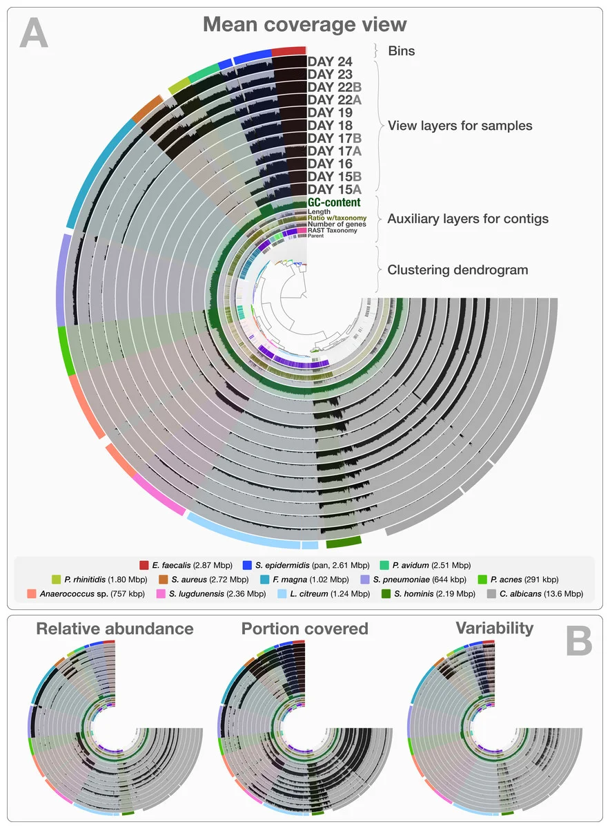
Fig. 2 from Eren et al. (2015). You spin me right round, baby, right round.

Fig. 2 from Eren et al. (2015). You spin me right round, baby, right round.

Intended for visualizing metagenomic sequence sets, anvi'o aims to be comprehensive yet easily usable, especially for researchers who actually want to observe differences between isolates. The output reminds me of Circos. It's notable here because, with metagenome or pangenome data sets, the biggest conclusion is often that we have the data in the first place. Drilling down to the sequence level is even better (though, as usual, I'm curious about how it handles viral genomes).

There's a short intro to using anvi'o for microbial pangenomics here, courtesy of its authors.

I haven't had a chance to play with anvi'o yet but it may be the difference between "this is a pangenome" and "we know which sequences aren't consistent across the pangenome".