Bad maps and artificial boundaries

An infographic appeared on my Facebook feed recently purporting to be a map of the most-streamed TV shows per state. This is the map:

We may never know what Washington, DC watches.

We may never know what Washington, DC watches.

The map is from a confusingly-named site called HomeSnacks. The site purports to "deliver bite-sized pieces of infotainment about where you live." I'm no fan of infotainment, primarily because it occasionally becomes a substitute for journalism, but also because it lowers the standard of data presentation for everyone. Data sources and methods are often poorly described in peer-reviewed research, so I suppose it isn't surprising to see infotainment sites like HomeSnacks fail to describe their methods at all.

I suspect that the streaming map shown above is specifically a map of Google searches related to popular TV shows. Good luck finding any methodology on HomeSnacks. A link on, er, viral content portal Distractify suggests Google Trends may be involved, though their title also claims the map is Netflix-specific. (The presence of shows like the HBO-specific Game of Thrones indicates otherwise.) Netflix famously doesn't release viewership data and third-party reports only include a handful of shows. Nielsen is supposedly generating some relevant data as well, though the data is not public and likely doesn't track every show available on every service. 

The collection of show titles on the map is suspicious as well. It's very unlikely that the most-watched show in each state would be almost unique to that state. If similar maps are any indication, each state's result is simply the result Googled most often in that state, unless the result has already been assigned to a state. I'm still suspicious of how few oddities there are. 

So, in the absence of an ideal data, there are two possibilities:

  1. The map is a work of fiction
  2. The map is based on state-specific Google searches and filtered to produce the highest value result not seen in any other state (except for Terriers, unless that's just a tie) 

I'd like to produce a better version. It's mostly due to my low tolerance for bad visualizations but also because I'm curious to know what the data really say. Millions of people spend billions of hours with these streaming services so it's a major cultural force (in terms of time spent doing one thing, at least).

In the absence of other data, Google Trends will have to serve as a proxy for viewing. This assumes that a search is equivalent to interest which in turn indicates a desire to view video content.

Here, we're just looking at relative volume of the search term "netflix" across the US since 2004. Maine, Idaho, New Mexico, and Montana all lead in Netflix Interest (July 2018 edit: this and the below maps are embedded rather than static, so the ranking has changed over time). They're also states with low population densities so that may be a factor. Is the same trend true for similar searches?

Maine and Idaho still lead in Hulu searches. The pattern remains similar. Hulu and Netflix both began streaming video in 2007 though Netflix began with DVDs ten years earlier, but perhaps the popularity of streaming video has erased that difference.*

Searches for streaming services probably don't reveal much. Is there any difference among searches for the names of popular TV shows? I arbitrarily chose three popular shows (Game of Thrones, Orange is the New Black, and House of Cards), then retrieved their state Google Trends results. These values are all on a scale of 0 to 100 with the maximum values indicating regions with the highest search incidence for that term. These values are only relative for a specific search term and are not comparable across terms except as an indicator of relative interest. In this case, Game of Thrones has greater overall search volume than the other two show names combined, but relative search interest for some other show may be higher in a particular region. In Arizona, for example, GoT has a value of 77 while Orange is 85.

So, keeping in mind that we're comparing regional interest rather than absolute popularity, here is a map of the highest-value of those three shows across the US:

DC is here, too. No Puerto Rico, though.

DC is here, too. No Puerto Rico, though.

I used the statebins package - it's great for keeping all those tiny New England states visible.

It looks like, in some ways, my map agrees with the HomeSnacks map: House of Cards is popular in and near DC, MA is interested in GoT, and Nevada residents search for Orange is the New Black frequently. The west coast and northeast are consistently GoT-dominated. I should note that this binning approach is artificial - some states, like Delaware, have very similar values for all three shows. If I was an unscrupulous blogger, though, I'd title this figure "The South Loves Prison Shows And The North Loves Dragons".

This is just one map on a clickbait site. You'd be right to assume I'm more concerned about it than I should be. The same site publishes articles about subjects like "the most dangerous cities in a given state" and those articles may be easily misinterpreted as genuine research. Mayors get irritated about that kind of approach, at least.**

I think this might be the real take-home message: be skeptical of any figure without a clear data source and remain skeptical if the source is Google Trends. The line between information and infotainment is easily blurred.


* Remember Qwikster?

** TL;DR: don't misuse crime ranking data.

Heatmaps in R, two ways

I'm going to get into the code as soon as possible here, but just so we're clear about one thing: a heatmap is just a matrix visualized with color gradients. Most of the time, looking at an entire matrix of data is overwhelming, especially if there isn't an obvious pattern to the data. A heatmap won't necessarily render that matrix less confusing but it can leverage our much-lauded human pattern-recognition abilities to see similarities among groups.

With R, there are quick ways to make heatmaps and there are tedious but finely-tuned ways. I'll demonstrate two of the latter type.

Let's assemble some example data first. We want a large set where every value is on the same scale (i.e., between -1 and 1).   

randup <- data.frame(group1 = rnorm(2500,mean=0.5,sd=0.1), group2 = rnorm(2500,mean=0.5,sd=0.2), group3 = rnorm(2500,mean=0.5,sd=0.15), group4 = rnorm(2500,mean=0.2,sd=0.11))

Using randomly-generated data is useful but avoids a few concerns, so I'll address them here:

  • You may need the rows or columns of your heatmap to follow a specific order, i.e. a taxonomy. Most heatmap methods will, by default, perform hierarchical clustering. 
  • If your data contains entries which aren't in your specified order, load the list of identifiers and match them doing something like this, where wantedlist contains the IDs you want in the order you want them, assuming those IDs should match those in the first column of your data frame:
want_ids <- wantedlist$V1
your_new_data <- your_data_frame[match(want_ids, your_data_frame$V1),]

Unmatching IDs, if any, will get labeled as NA. You can remove them with complete.cases as follows:

your_new_data <- your_new_data[complete.cases(your_new_data),]

Or, enforce uniqueness with something like

rownames(your_new_data) = make.names(your_new_data$X, unique=TRUE)

Differences in the two lists (that is, the IDs you want and the IDs you have in the data frame) can be checked with setdiff().
Remember that you need to check in two directions, or

setdiff(a,b)
setdiff(b,a)

Removing offending IDs from the list may mean that other graphical elements, like trees, will need to be rebuilt. NA values in the data may also create empty spaces in the heatmap, so you can set them all to zero:

your_new_data[is.na(your_new_data)] <- 0

Then they'll still be empty but the correct color, at least.

Finally, ensure that your IDs are actually being used as IDs and not values in the data frame.

row.names(your_new_data) <- your_new_data$V1
your_new_data <- your_new_data[,-1]

OK, let's start making some maps. The first example uses the packages vegan and gplots (heatmap.2, specifically) so make sure they're installed and loaded first. We'll cluster rows and will start by converting to a matrix.

randup.m <- as.matrix(randup)
scaleRYG <- colorRampPalette(c("red","yellow","darkgreen"), space = "rgb")(30)
data.dist <-vegdist(randup.m, method = "euclidean")
row.clus <-hclust(data.dist, "aver")

heatmap.2(randup.m, Rowv = as.dendrogram(row.clus), dendrogram = "row", col=scaleRYG, margins = c(7,10), density.info = "none", trace = "none", lhei = c(2,6), colsep = 1:3, sepcolor = "black", sepwidth =c(0.001,0.0001), xlab = "Identifier", ylab = "Rows")

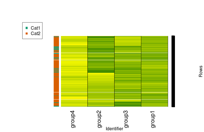
By default, heatmap.2 includes a color key, row labels, and a row dendrogram. The white line in the middle here is a resizing artifact but may also show up if you have NAs in your data. We can omit both of the dendrograms by setting dendrogram to "none" and can ignore our clustering by setting both Rowv and Colv to FALSE. We essentially get a raw heatmap that way:

Note that vegdist and hclust both offer different methods to try. Note also that hclust works on rows, so if you want distances between columns, transpose the matrix using t() when clustering (here, where we assign a value to row.clus). 

Now, let's imagine we have some kind of categorical variables for our data. We'll put everything with an average of at least 0.5 across all groups in Cat 1 and everything else in Cat 2. Generate those labels as follows:

randmeans <- rowMeans(randup)
randup$rowmean <- randmeans
randup$cat <- ifelse(randup$rowmean>0.5, "Cat1","Cat2")
randup$rowmean <- NULL

Install and load the RColorBrewer package as well.

Now let's make it:

mycol <- brewer.pal(3, "Dark2")

f <- factor(randup$cat)
test.d <- as.dendrogram(row.clus)

heatmap.2(randup.m, Rowv = test.d, dendrogram = "none", col=scaleRYG, margins = c(7,10), density.info = "none", trace = "none", colsep = 1:3, sepcolor = "black", sepwidth =c(0.001,0.0001), xlab = "Identifier", ylab = "Rows", RowSideColors=mycol[f], key = FALSE)

legend(x="topleft", legend=levels(f), col=mycol[factor(levels(f))], pch=15)

Or, in a more minimal and more appropriately stretched fashion:

heatmap.2(randup.m, Rowv = test.d, dendrogram = "none", col=scaleRYG, density.info = "none", trace = "none", colsep = 1:3, sepcolor = "black", sepwidth =c(0.001,0.0001), RowSideColors=mycol[f], key = FALSE, labRow = "", cexCol=1.25)

But that's just one way to make a heatmap! The heatmap.2 function has been around for years. Is there a newer option we can use just for the sake of using the newest option? Even better, is there an option that will do most of the work for us?

Try out the ComplexHeatmap package through Bioconductor. This will require you to install Bioconductor if you don't have it already - see this page for details. The package has some nice, extensive documentation.

Once you're ready, install and load ComplexHeatmap, then provide it with our matrix.

source("https://bioconductor.org/biocLite.R")
biocLite("ComplexHeatmap")
library("ComplexHeatmap")
Heatmap(randup.m, col = scaleRYG, name = "Value", cluster_rows = FALSE, cluster_columns = FALSE)

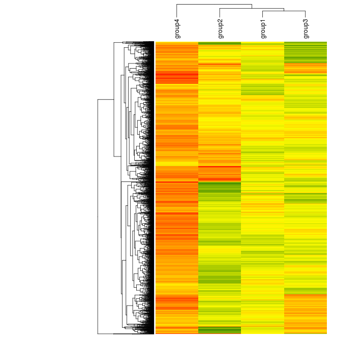
ComplexHeatmap handles color scales differently than heatmap.2 does, so you'll notice that there's more red here. The lower end of the scale has been set at -0.5. We get a more informative range of colors in the process. We can still produce a similar range if we wish:

library(circlize)

Heatmap(randup.m, name = "Value", cluster_rows = FALSE, cluster_columns = FALSE, col = colorRamp2(c(-1, 0, 1), c("red", "yellow", "darkgreen")))

We can cluster it, too, but this time we can more easily rearrange positions of elements like labels.

Heatmap(randup.m, col = scaleRYG, name = "Value", clustering_distance_rows = "euclidean", clustering_method_rows = "aver", column_names_side = "top", width = unit(16,"cm"), row_dend_width = unit(4, "cm"), show_heatmap_legend = FALSE)

The ComplexHeatmap documentation provides detailed examples, including those with a variety of different annotation styles. It provides many of the features I've had to fight with gplots to get thus far.

In case you need other options, here are a few more ways to construct heatmaps in R:

Happy mapping!

Many-legged codebeasts from the deep

I've been enjoying the existence of GitKraken lately. It's a graphical Git client with just enough features and visual details to be useful but not so many that it gets bogged down.* I'm not enough of a hardcore coder to enjoy using Git's GLI so a well-designed GUI is great to have. GitKraken is in open beta for now and doesn't cost anything to use. It's also cross-platform, in case you're constantly bouncing between operating systems.

There are also projects like GitView - that one hasn't been updated for almost a decade but is decidedly more barebones than GitKraken. Maybe you don't need something fancy. Maybe you don't need a Git GUI at all. Maybe you don't know what you need.

* I'm not sure the same can be said of their website. It's interesting but it doesn't really say "hey! let's get organized about this whole version management thing!"

Condiments and weather for Friday

Hello there! I've been rather busy over the last month or so and haven't been writing here as much. I'm sure you know what it's like.

I was also in Germany for a week, then came back to the US and hit a blizzard. I'll post more photos later, but for now, this first photo will represent Germany and the second will represent the snow.

This is Star Wars themed mustard. I imagine one can buy a similar product in the US but this is one mustard of many in your average German supermarket. All the photos I took on this trip are monochromatic.

This is Star Wars themed mustard. I imagine one can buy a similar product in the US but this is one mustard of many in your average German supermarket. All the photos I took on this trip are monochromatic.


This is my car. I've blurred out the license plate so you can't steal my identity.

This is my car. I've blurred out the license plate so you can't steal my identity.

More material will be coming soon, including papers I've found interesting lately, complaints about software, and more contrast-heavy photos.

Mining for text and minding for graphs

Here are two quick items of interest:

  • A recent PLOS Computational Biology methods paper about text mining for protein interactions. As the title "Text Mining for Protein Docking" indicates, the authors are interested in characterizing interactions at the residue level. I'm in favor of any work seeking to draw conclusions from existing but yet-unconnected data. It will be interesting to see where this group goes next.
  • Mind the Graph, a tool for assembling scientific images from templates. It's essentially a clip art collection. Remember when clip art was distributed in [any form other than Google Image Search]? This tool is like that. I found their image collections rather limiting at the moment: there are plenty of animal-specific images but very few appropriate to microbiology or even microbial genetics. Export options also appear to be limited to PNG bitmaps in the free version. That being said, if you have just 15 minutes to assemble a figure before a crucial meeting, Mind the Graph may be essential.
Example output from Mind the Graph. Now I've gone anthropomorphic with a phage again.

Example output from Mind the Graph. Now I've gone anthropomorphic with a phage again.